Us.
———— CAMPAIGN

————
Wheat’s End is a “worry-free” restaurant, with a truly gluten-free and vegan menu. The restaurant is an incredible safe haven for its customers who are tired of being left out.
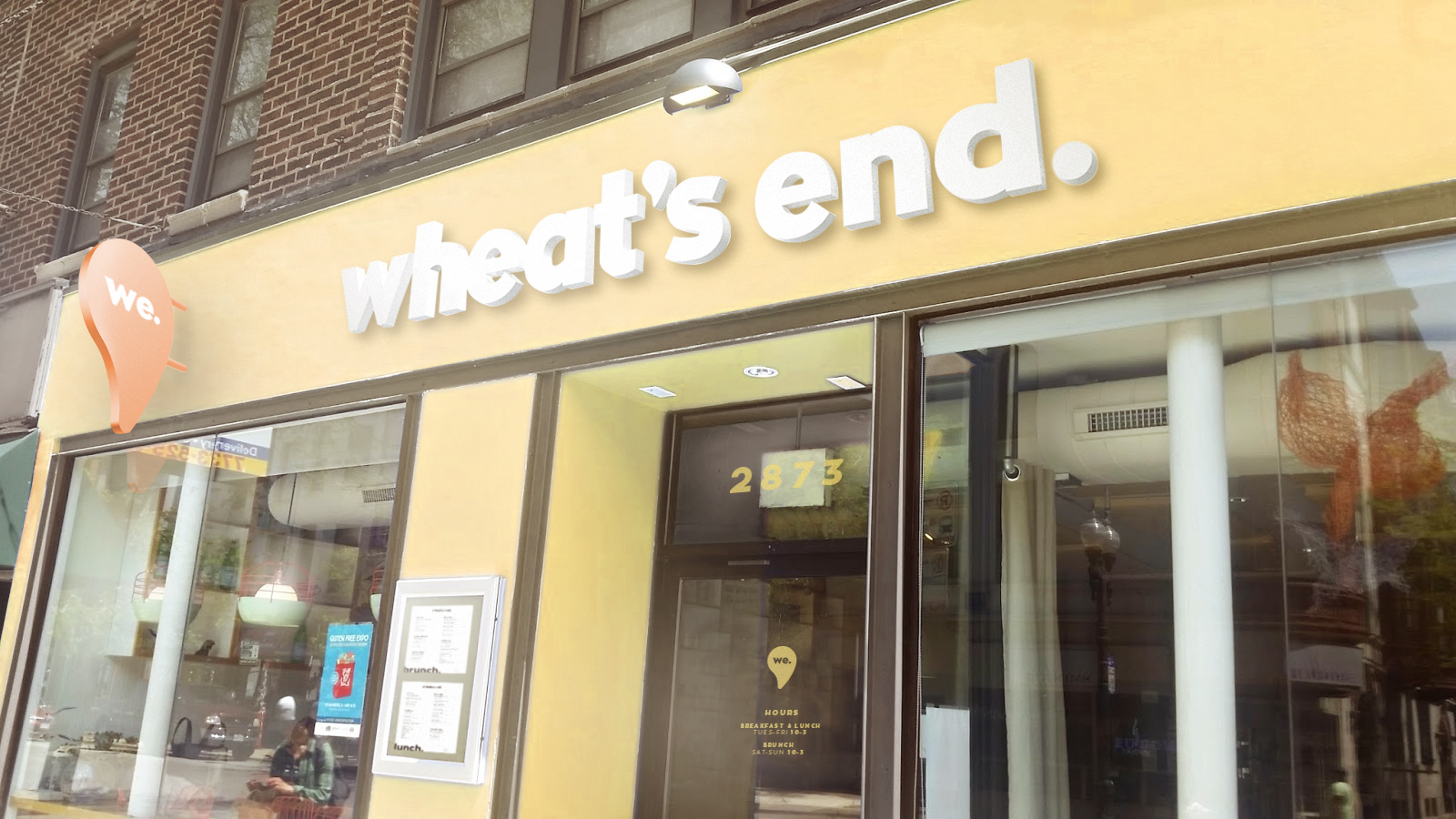
Being gluten and lactose-intolerant, I love Wheat’s End, and felt they deserved a rebrand to show how great they are. The purpose of the new identity design was to show the community that Wheat’s End creates and nourishes. It has become a safe space for the intestinally impaired, and I wanted to have that be the driving force in the design.

————
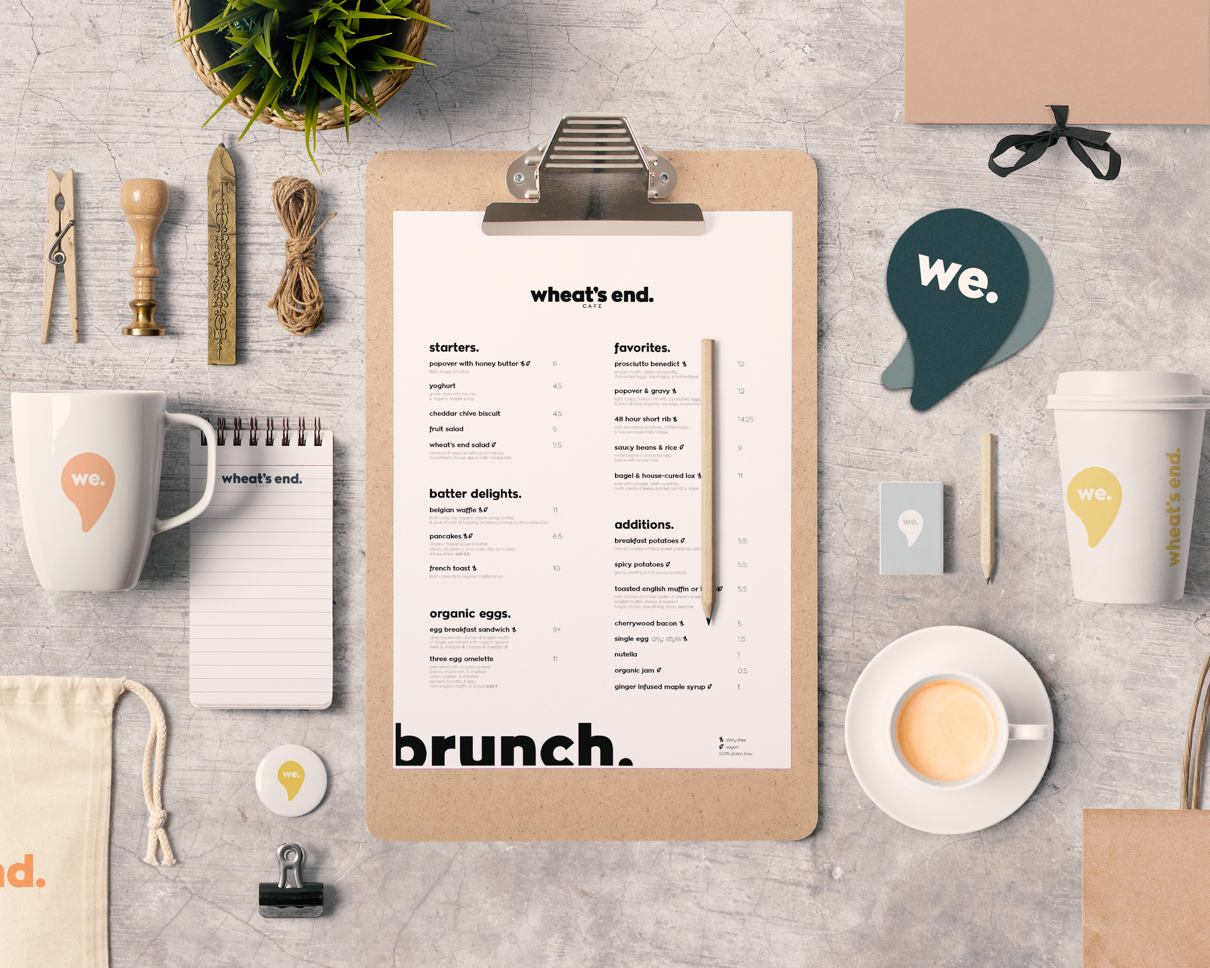
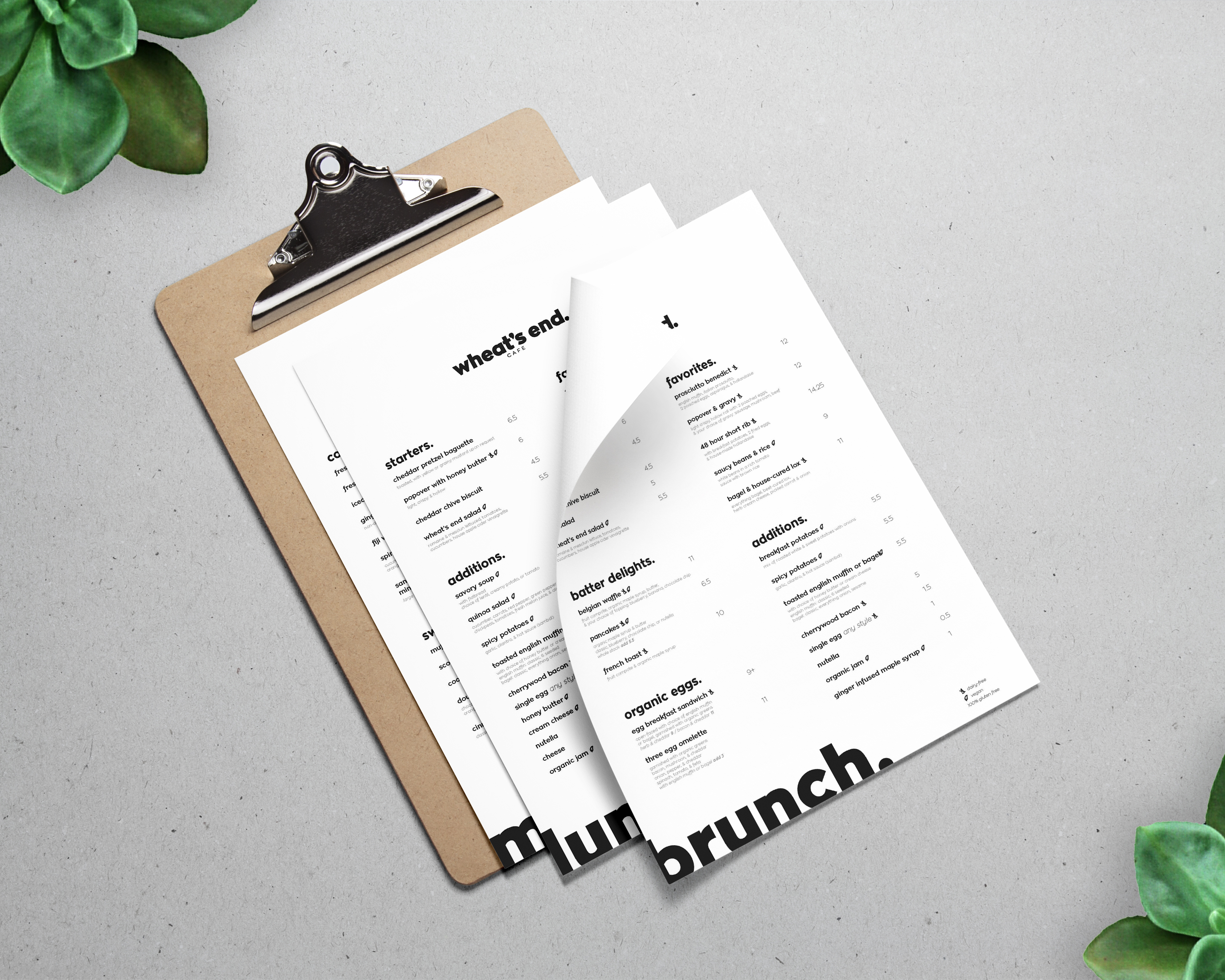
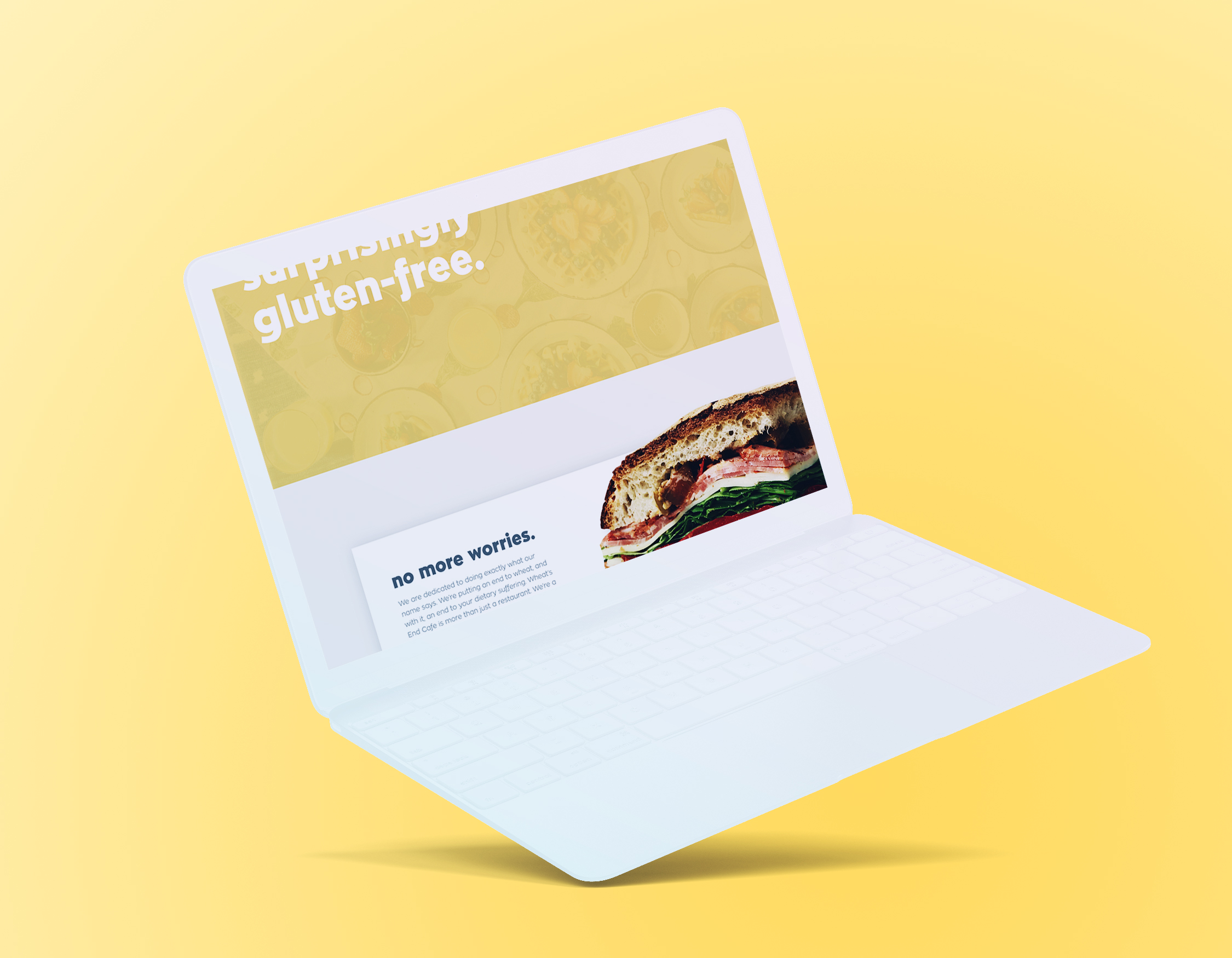
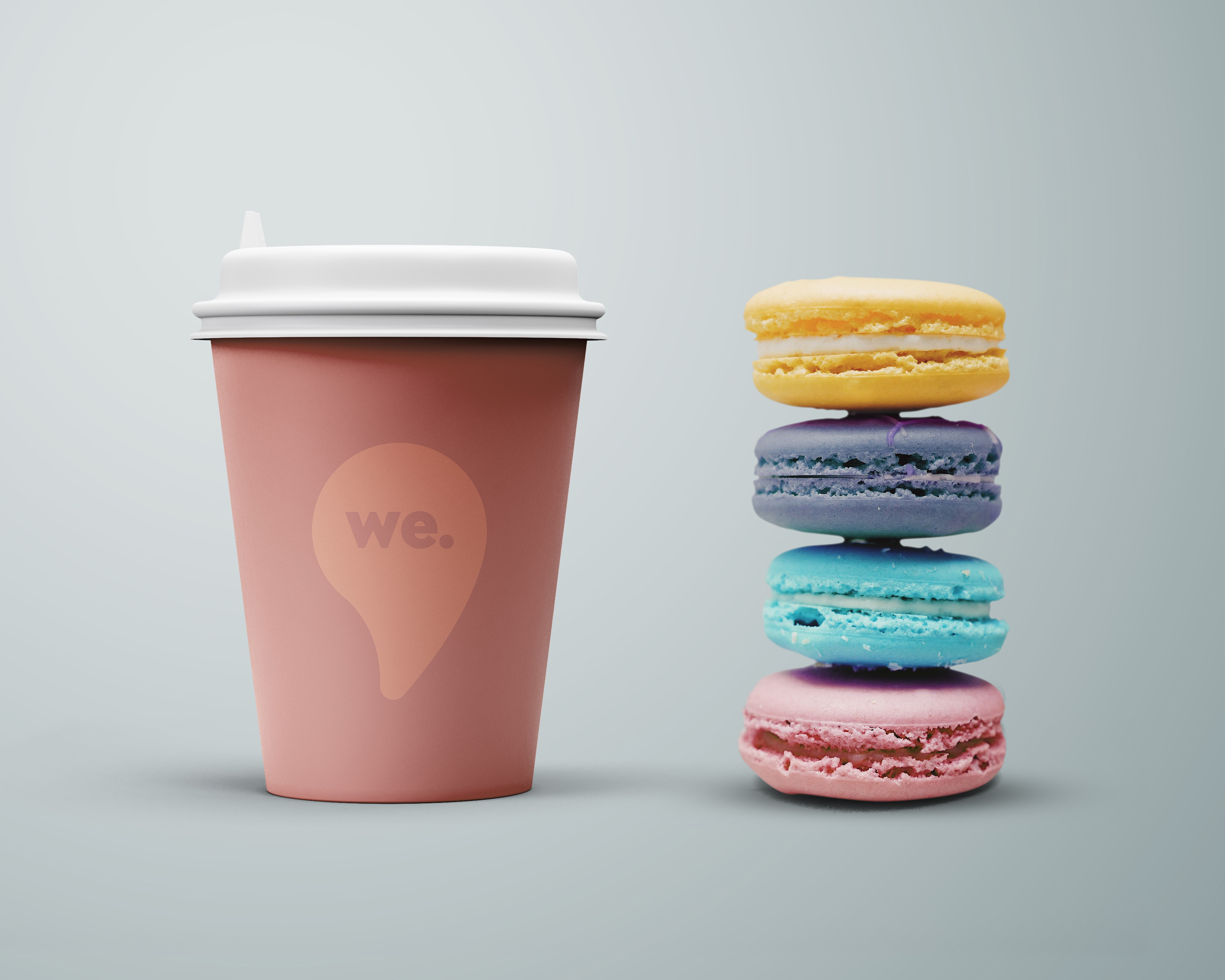
With a focus on function, the design of the identity followed as a compliment to the restaurant. It remained relaxed and refined, better matching the design of the physical location. I updated their stationery, including everything from their menus to their coasters. I also reassessed the web experience, with a new focus on legibility.

————
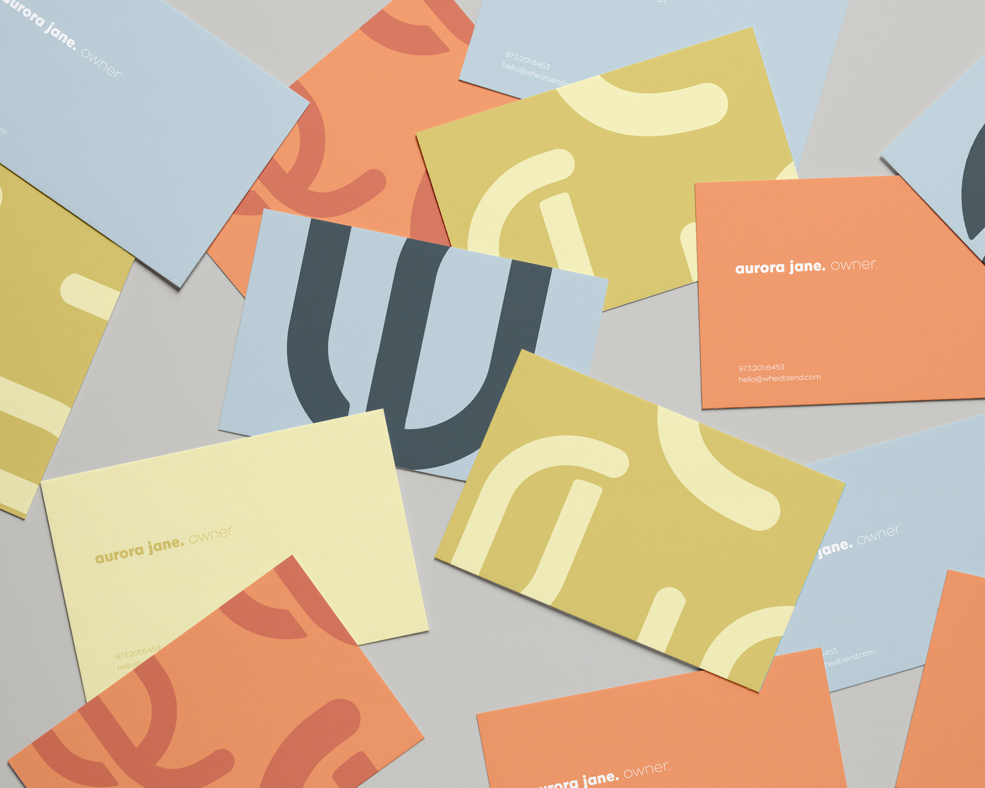
It felt important to bring several colors into the brand and move away from the overpowering purple which they presently use. The lighter, pastel color palette compliments the sentiments of the brand, and feels more inviting.
————
I am Tanner Puzio, a designer
living and working in Chicago
I am in love with communication, and using anything at my disposal to tell a narrative. With a focus on brand and identity design, my goal is to create compelling stories and craft beautiful experiences for brands and consumers.
